Poster Campaigns
Event Poster Campaigns
A-Z Poster Distribution is the UK’s leading event poster campaign company. We specialise in high-impact shop window postering for events UK-wide.
Nationwide Postering service
We provide poster campaign services for events all over the whole of the UK and Ireland.
Cost Effective Advertising
Recent research show that over 65% of ticket sales are directly related to the advance poster campaign
Photographic Evidence
We can provide full photographic evidence of our poster campaigns if required.
No Fly Posting
No Fly Posting. We talk shopkeepers into letting us display posters in their shop windows
Poster Printers
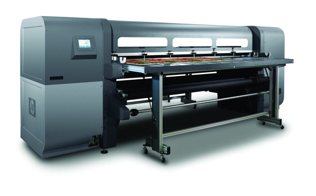
We do not print posters and leaflets used for advertising your event ourselves. But we can just let you know about suitable local or specialist event printers for designing and printing all your events posters, flyers and vouchers. If using our shop postering service, we recommend that you use double-sided posters on your event’s poster campaign.


Poster Design
Well-designed posters can make a world of difference to the success of your event. The design of the event’s poster is often intentionally cryptic. Sometimes, poster campaigns use straightforward poster designs. Large letters and bold colours are chosen to give the maximum impact. More often than not, it is about getting a good balance of style and impact. Keeping the main points obvious is a vital part of poster design.
The title and advertising slogan for the poster campaign are essential. Also, the date and the event’s venue. These crucial bits of information should be instantly visible on your poster. Keeping the information on the event’s poster to a bare minimum helps to reduce clutter. If using more than a few words on your poster, it’s best to use both capital and lowercase lettering. Capitals on the poster are best used for emphasis or to attract the attention of a passerby. Lettering should be correctly spaced, so it’s easy to read. Posters are often seen from a distance, so the right colours are essential to draw you in.
Other considerations
Think about what your poster will look like behind glass because posters will often be placed in shop windows. Also, primary colours can be seen more quickly. However, light colours usually could be better in poster design. Because the text is harder to see unless a dark contrasting background is used, the text on the posters should always have enough contrast to make it stand out.
When designing the poster for your poster campaign. It would be best to consider everything else in the shop windows. Simply put, your poster design needs to stand out from the crowd.
If possible, include QR codes on the poster with links to the event’s Facebook page or website. Please read our article about this here.
Vouchers Used For Poster campaigns.
While doing an events poster campaign. We often use some form of offer or discount voucher. Sometimes, these are needed to coax the shopkeeper into displaying your poster—usually, these vouchers are great for convincing shopkeepers. But also attend your event themselves to come and spend their money. Never underestimate the good business sense these vouchers make on their own. If the shopkeeper likes the event, they are much more likely to display your poster next time. Because of this, your event and client base will increase in reputation.

Contact
Get in touch for any advice or a competitive poster advertising quote
-
A-Z Poster Distribution
38 Fernley Court, Maidenhead - (+44) 1753 569543
- [email protected]
